Showing posts with label Ancillary. Show all posts

Tuesday, 19 April 2011

Evaluation - The Effectiveness of Our Products as a Package

How effective is the combination of your main product and the ancillary texts?

Comparing music videos with the relevant album and posters there is generally no real connection, unlike films and their promotional packages which are connected very closely. Our music video and the rest of our promotional package are not closely linked. Our music video connects with the lyrics of the song we chose, and the song we chose is a part of the album. We used the same location for the pictures in our ancillary task as the shots we took for the stage performance shots, we also used the same outfit. This is effective because it gives the impression that the ancillary products and the music video are part of the same product package. The idea of everything as one package, is to create an image of the artist and send out an impression to the public. By the video, album, and poster being slightly different, this creates a wider target audience for the artist.

During our music video our artist appears to be quite cheeky, and outspoken. I tried to convey this in the pictures chosen for my ancillary task, I did this by choosing a photograph for the front cover of her with a cheeky smile, the insert photograph she's in a performance position and looks very comfortable in who she is, and the back cover she's standing with her hand on her hip. All of these pictures show a connection to moments of self confident attitude which are also present in our music video.
Here is a screenshot of a similar position during the music video compared to one on my album cover.
The title of the album 'One of the boys' also fits with the self confidence attitude theme running through, as it gives the impression of being a tom boy.

I kept to the theme of stars for my album cover and insert. This was so it wasn't bitty and came together nicely. On the insert is the lyrics of the song we used, as in many album covers they list the lyrics of the songs. Click here to see my completed album artwork, and here to see my completed poster.

I think it's important to have some similarities between the poster and the album cover but also to give the fans a taste of something different. I used some of the same font and colours on the poster as on the album, I also put a picture of the album cover on the poster advertising it's release.

Sunday, 17 April 2011

Evaluation - Challenging Codes and Conventions

In what ways does you media product use, develop or challenge the codes and conventions of real media products?

For our A2 media project we had to produce a music video, an album cover with inserts and a promotional poster, these would all form part of a promotional media package. All 3 products link together using and developing existing pop genre media techniques. We have also challenged many of these codes and conventions.

If you go here you can see our performance and narrative pitch. By looking at other music videos from our genre, we found that most narrative parts focused on romantic relationships between a man and a woman. We decided that we wanted to keep the feeling of a close relationship, to link in with the lyrics. instead of a romantic relationship we developed the normal codes and conventions and focused our narrative on a friendship between two girls. From feedback we received it was not always completely clear that we had created a friendship environment, but possibly a same sex romantic relationship. This still goes against the conventions of existing media texts, because most videos portray heterosexual relationships instead of same sex. We noticed that many shots in the original 'Hot 'n' Cold' music video, Katy Perry sings during narrative shots, this is very typical of the pop genre. We decided to incorporate this into our music video.

When it comes to the performance shots of our music video we were more traditional, and used techniques from videos we had looked at. From looking at 'Ellie Gouldings - Starry Eyed' used similar techniques for our on stage performance, the expression in her face and directly looking into the camera singing.During the video Ellie Goulding stays in one spot but dances with her arms and knees. We got Emma to do the same in our performance shots. By using a variety of different shots in the same location focusing on Emma, makes her the centre of attention, which is the case in many music videos from this genre. We also looked at 'Lily Allen - Smile' Throughout her music video she's in her own personal space in a bedroom, singing into the camera in different positions on the bed. We decided to do the same in our music video, as it connects the audience to our artist as she is seen as vulnerable.

For our ancillary task we decided to use the original name of the artist and the album. When looking at existing album covers we discovered that quite often there was a picture of the artist with a plain background, generally black, white or other dark colours, with the except of the original album cover for 'Katy Perry - One of the boys' which is a picture of Katy Perry on a sun lounger in a brightly coloured garden. However most of these album covers didn't relate to the album name. However I also looked at singles covers and found these to be more elaborate and generally related to the song title. I decided to try and use the codes and conventions of existing media texts, and chose a dark blue/black background with stars to add that little bit of excitement similar to Ellie Goulding's single cover and Katy Perry's album cover. I also used very similar font and font colours to the original album cover on mine.


When researching posters pretty much all of them in our genre had white backgrounds and use one colour font. When looking at Lily Allen's poster for her tour 'With Natalie Portman's shaved head' she has used an animation of her our face and colour it pink. I decided to use the same technique. However instead of only using one colour for the font on my poster I decided to use two colours, the same as the album cover. I also noticed that posters were quite often very similar to the album cover. Challenging this I decided to use a photograph of Emma with curly hair instead of straight like in our music video and on our album cover. However you can still see the album and the poster are related.

Thursday, 17 February 2011

CD cover development

As I want to create a professional looking CD cover and poster package, I used photoshop to do this. Using various layers of images and masking tools to create the desired effect.

Wednesday, 16 February 2011

Ancillary task photoshoot

Here are some of the photographs we took to use on our ancillary tasks. We decided to keep our artist in the same clothing as the performance shots in our music video. This is in keeping with the codes and conventions of our genre, as most album covers use photographs of artists in performance clothing.

Saturday, 22 January 2011

Artistic inspiration


As the ancillary task for this project is to create an album cover, inlays, and a poster, I looked for inspiration for my artwork. Most album covers from our genre have plain background, generally black or white. I wanted to try and keep with this convention, however wanted to look at other covers that challenged it slightly. Looking at Ellie Gouldings single cover for Starry eyed, there is still a quite plain background used but this time using a dark blue with a few stars. I like this idea and wish to use it in my ancillary task later. However unlike Ellie Gouldings cover, I would like to use brightly coloured lettering similar to Katy Perrys teenage dream album cover.

Sunday, 19 September 2010

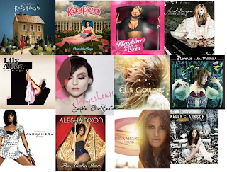
Existing album covers moodboard

In order to create an idea of the type of album covers our artist and similar artists use to inspire our own creation we created a moodboard of existing album covers. This allowed us to easily compare similarities and differences between the album covers.